Packaging is the science, art, and technology of enclosing or protecting products for distribution, storage, sale, and use. Product Packaging Design is a pivotal marketing tool as it defines the product ; it is not just the wrapping material around a specific item which serves to contain, identify, describe, protect, display, promote or otherwise make the product marketable and keep it clean. The Packaging design or concept plays an integral role in brand promotion because it channels and communicates the image and the identity of the company behind it.
As packaging has a great impact on the marketing of the given product the packaging design must be creative and artistic ; because as important as the product or service you are selling, the package it comes in is ultimately your best sales tool. Consumer packaging design is ultimately your silent sales person which sells that particular product to the consumer , right there on the shelf right next to your competition. We have gathered some very stylish and exciting examples of Bottle Product Packaging Designs which possess a compelling voice and package design identity that captures the unique positioning opportunity to the product itself. We hope you will find inspiration with the following brands .
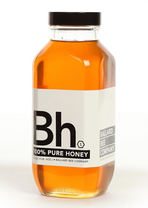
1. Ballard Bee Company
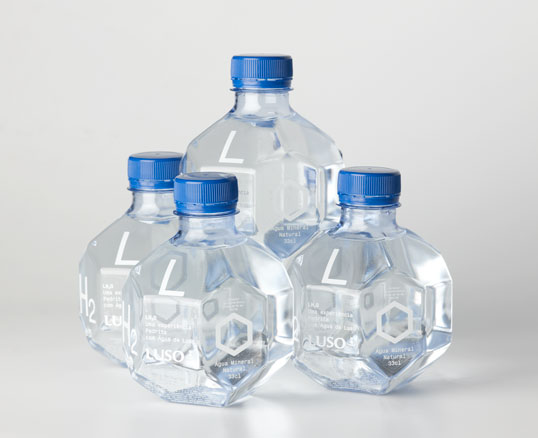
2. Pedrita
LH2O is a research project on a new form for Água de Luso (Luso water) and the result of a collaboration between Pedrita studio and the Luso brand. This project aims to find not only a new form for this liquid, but also to come up with a bottle that illustrates the qualities and unique properties of Água de Luso, which has been part of the life and body of the Portuguese for over 150 years.
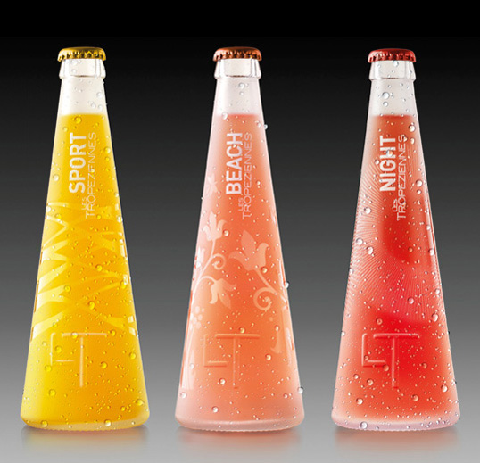
3. LT Corretje
Designed by Corretje Comunicació Grafica | Country: Spain
Corretje Comunicació Grafica won the gold award at the 2010 Pentawards for developing these three different bottles for Les Tropeziennes waters.
4. AM | PM
Packaging for the Aviara AM/PM health drinks was designed by Axis41 in Salt Lake City. Aviara is a San Diego-based nutrition company that developed the AM and PM beverage system to help promote a healthy and vibrant life. The AM drink helps to boost energy levels at the start of the day. The PM drink helps to calm and soothe the nerves at the end of the day.
The flowers represent the botanicals that make up the formulation of these two drinks. Growing plants and flowers communicate health, which is exactly what these drinks promote. The bold, clean typography contrasts with the illustrated style of the flowers and helps to convey a sense of health and purpose. The designs were silk screened ink on frosted glass, allowing the color of each drink to become the color of the packaging.

5. EVR Resveratrol
The new brand positioning, name, logo and packaging was created by Dragon Rouge, a global branding and design consultancy. “The first challenge for the Dragon Rouge team,” says Eric Zeitoun, president of the New York office of Dragon Rouge, “was to remove all associations with alcohol for the beverage. Initially, Preventiv Waters’ flavors were named ‘Pomegranate Pinot,’ ‘Cabernet Grape,’ and ‘Berry Bordeaux,’ referencing three red wine grape varietals.
Dragon Rouge helped develop the new brand positioning, built around the brand idea of fueling ‘positive momentum’ for a healthy lifestyle for the target consumer who tends to be proactive in their lifestyle and attitude when it comes to health management.
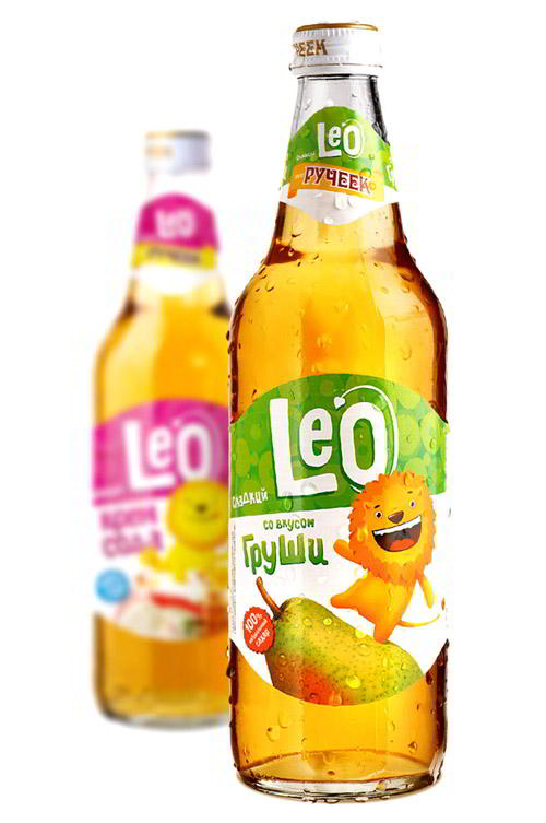
6. Leo
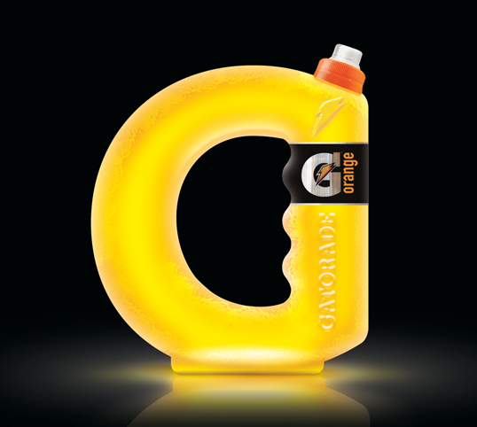
7. Gatorade Soft Drink
This is an interesting concept from British designer Cadú Gomes exploring unique structural design. By incorporating Gatorade’s identity into the bottle, this packaging takes brand recognition to a whole other level.
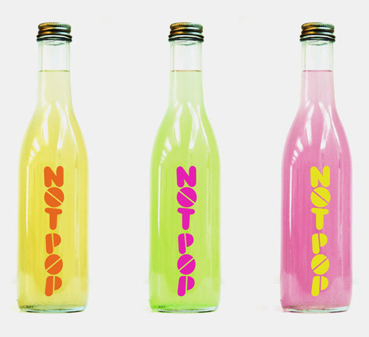
8. Not Pop
Designed by Schwartz & Sons | Country: United States
This packaging and logo program was created at Partners and Spade for a juice called Not Pop.
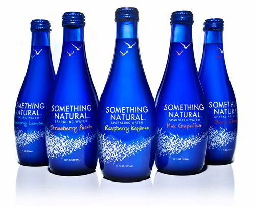
9. Something Natural Sparkling Water
10. Gravity
11. Tequila
12. Bottlegreen
Premium soft drink brand Bottlegreen is to unveil a range of stylish limited edition sparkling pressé bottles for the festive season, in stores from early November. The designs were created by textile design graduate, Rachel Pitman, following a nationwide talent search by Bottlegreen Drinks Co.
The bottlegreen brand identity and packaging was created by Ziggurat Brands, and reflects the brands superbly crafted cordials, using traditional wine blending processes. Ziggurat Brands came up with the idea of approaching second and third year UK textile design students to create a label design for a range of bottlegreen limited edition sparkling pressés.
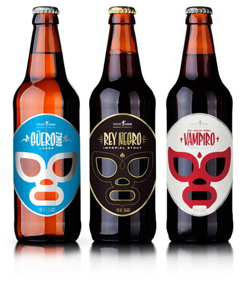
13. Cerveceria Sagrada
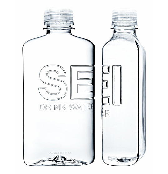
14. SEI Water
The bottle shape, inspired by the military canteen, is designed around the principle of portability and utilization of space while maintaining a subtle harmony of form and function. The bottle is useful and fashionable; and the taste of SEI natural spring water is pure and crisp.
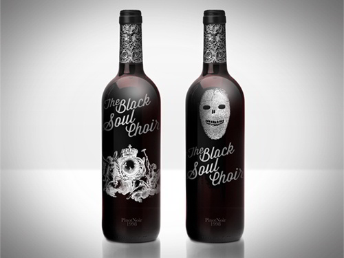
15. Black Soul Choir Wine
16 Coca Cola
17. Ping
Packaging made for a healthy energy drink illustrated like a speedometer showing all ingredients and % amounts in the front label. The idea for the product and design was create as part of an assessment brief
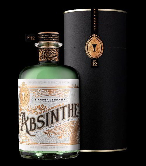
18. Absinthe
19. Absolute Vodka
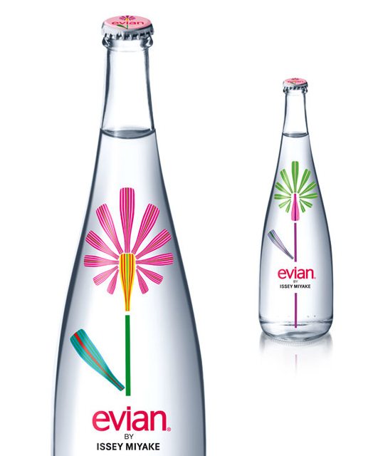
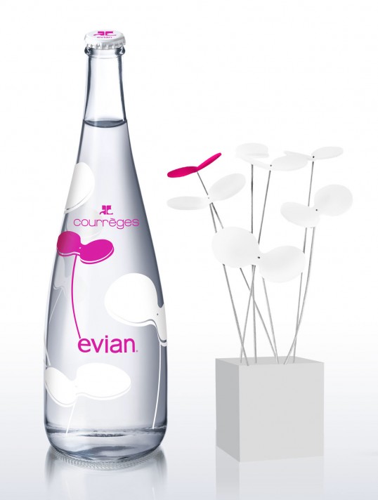
20.Evian Water | Courreges
Designed by House of Courrèges | Country: France
This design combines evian’s free-minded spirit with the House of Courrèges’ nonconventional creativity.
Courrèges, approaching the eve of its 50-year anniversary, is known for pioneering key trends though the decades, from having discovered pants for women in 1963 to starting the mini-skirt revolution. The house of Courrèges is driven by the will to free women from the classical conventions of fashion by developing new forms, implementing new materials and using vibrant colors.
21. Calpis
Beautiful brand identity extending across multiple products for Japan’s The Calpis Food Industry Co.
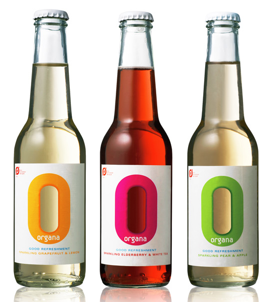
22. Organa Sparkling Water
We could use some fancy marketing slogan to describe our drink. But we believe that’s not necessary as it’s all in the name. Organa is made from only natural, organic ingredients and sparkling water. We leave the judgement up to the most important person – you. Enjoy cold.
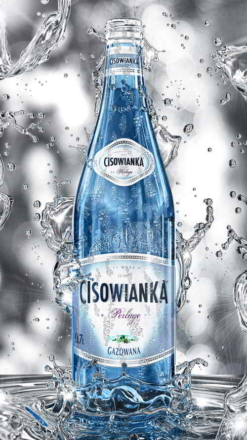
23. Perlage Bottle
24. ORA-ITO
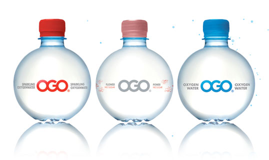
The man behind the unique design of the highly distinctive OGO water bottle is Ora-Ito, the brand name of the designer Ito Morabito. In 2002 Ora-Ito received the ‘Oscar for the best packaging’. His style is described as ‘simplexity’; simple in it’s complexity .
The OGO brand belongs to the world of style, inspiration, fashion and sport. OGO has appeared in London Fashion Week shows by Julien Macdonald and Michiko Koshino. Avant-garde designer Jeremy Scott has used OGO in Paris. In sport, OGO is a natural for stars like English rugby international Olly Barkley. The press frequently link OGO with top celebrities.
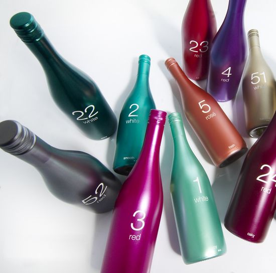
25. 94 Wines
94Wines is recognizable, contemporary and a high quality wine. Every wine has its unique color and number, through which the wine drinker can easily come to the right choice. The different numbers represent
the variety of tastes that are all featured via a numeric range.

