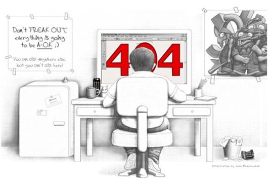
We know of several mistakes that a web designer often makes while web designing. Here we present such top 10 web design blunders one must avoid. These may be some of the common mistakes but should be almost completely avoided to make sure the design looks smooth and effortless. Most of these apply to any kind of website, be it a business website or a personal blog.
1. Erratic Theme and Poor Focus:
The website’s design must tell the viewer what it is about, in no time. If a visitor comes to your website and fails to figure out what it is about, then you can take it for granted that he/she would never come back… So, the design and header of the site must make it as obvious as possible, and provide the best user experience from the outset – don’t try to put pictures of celebrities in the banner of a local classifieds site, as this will only mislead the folks!
2. Use the Fonts Sensibly and Smartly:
While you can use all kinds of jazzy fonts to make your web pages look sophisticated and up class, never forget that the content should be easily readable. A visitor will not take pain to figure out the words written on your pages.
3. Don’t Open Every Link in New Window:
Do not worry about your visitors going to another website and force them to open a new window after every click. This would make his/her screen messy and s/he won’t like it. Let them have the control of where the pages open, and if your website turns out to be impressive and helpful, you can be rest assured that your visitors will automatically come back to you.
4. Avoid Unnecessary Forced Registration:
If you force visitors to register right at the outset, this will only irritate them. Of course if you have something substantial to sell, that you think would convince the visitors to register then you can go ahead; otherwise registration pages are big time traffic turn offs.
5. Extensive Use of Flash is Not Cool:
Flash can make a huge impact when used within limits, and smartly, but at the same time it can irritate the visitors big time, not to mention it increases the page opening time as well.
6. Avoid Imposing Music on Your Visitors:
Some features on your website might require audio files, which is fine but let the visitor have the option of playing it or not. Nobody likes to see plugins getting automatically downloaded on their systems just for the heck of seeing your site properly!
7. Make the Content More Easily Accessible:
Do not use a homepage, which does nothing but launches the website… Make sure that after reaching the homepage, the visitor easily gets the path to reach where s/he wants to go – i.e. user navigation must be really smooth!
[highlight-yellow]Consider adding HTML sitemaps for human visitors as well as XML sitemaps for search engine bots.[/highlight-yellow]
8. Breaking Back Button is One of the Worst Web Design Blunders:
How often have you been irritated when you visit a web page, and see the browser back button disabled? Opening new windows breaks the back button and some javascripts do that too.
9. Adopt Simpler and Understandable URL Structure:
A complex url with all kinds of symbols will not only hamper your search engine rankings, and in turn the traffic but it will also not help the visitor to understand the content of your page.
Hence if the contents of your web page are focused on “web design tips” then <sitename.com*gt;/web-design-tips is an ideal URL, though you may consider adding a unique number or a tag to it as well, but a URL like <sitename.com>/57878-&web=%^-design1234^$tips^&* will never do any good!
10. Have a Local Search Box and Easy Sidebar Navigation:
Make sure the visitor can type a keyword and search related content in your website. This would significantly help in building loyal traffic, and push the bounce rate down. Displaying related posts below the content is always a great way to fight high bounce rate, but that doesn’t have too much to do with the design part though.
[highlight-yellow]Lack of navigation links in the sidebar can also make the life of visitors really difficult, because nobody would really want to click on the sitemap every single time, to visitor the desired page!
These design blunders are very obvious yet common ones but can affect the popularity and performance of your site to a great extent, if avoided at the right time, while you are designing your website. Always focus on retaining the visitors and don not try to hard to attract the mass with extreme measures!


