Artistic trends often start small but grow promptly until people tend to move to the next big thing. Trends are sometimes difficult to understand, and good trends may take the time to develop. The flat design had been a part of web design for a long period of time but it is now trending in the mainstream.
Multi-billionaire companies like Microsoft and Apple have taken quite an interest in flat designs. Questions rise with this, why flat web designs are preferred? What makes flat designs usable and relatable? Let’s find out these questions’ answer below.
So, the first question may rise what exactly is a flat design?
As by name, flat design is defined by the flatness of style; simplifying an interface by removing extra 3D looks such as shadows, bevels, textures, and gradients.
The wish to create more digital interface gave birth to the flat design. It’s an open canvas for the interface of a digital device.
Evolution of Flat Design
This term ‘Flat Design’ was coined by Allan Grinshtein. In his post “The Flat Design Era”, Allan explains that “elegant interfaces are ones that have the most impact with the fewest elements”. The core idea of this concept is to minimalize interface which will in result be well suited to its function in comparison to a more embroidered, complex one. With this move, flat designs started establishing their value in web designing. Almost all flat designs of today work on five principles- no added effects, simple design and UI elements, a focus on typography, color and an overall minimalist approach. Now, let’s discuss some of the prime features of flat designs which have impacted the current design trend.
Block Elements
The main focus of flat design layout is to offer a grid-focussed view. This idea increased the use of block elements that can fit into a page as squares and rectangles. There might be a possibility that other shapes can be used, but most of the layout follows the grid format.
Obviously, this is not the only choice but flat web page elements lend themselves to ideology. The concept of flat design actually pushes away from the depth, because of this reason most designers didn’t feel the need to break outside the predefined grid. Hence, this makes the designers strikingly comfortable to work with block elements to arrange page contents.
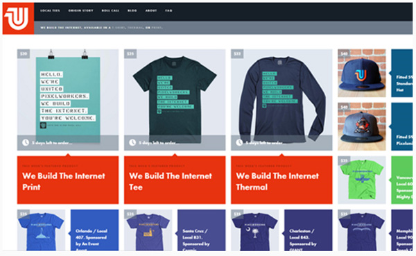
As you can see the above image, using the grid format is incredibly awesome. Every product is listed in a block style layout and you have to agree it’s awesome.
Simple Icons
Flat design accompanied the largest resurrection of unsophisticated line icons used for website interfaces. Apple’s iOS7 was one of the major contributors to this trend. They suggested their designers to use simple icons.
The sole purpose of icon design is to transfer an idea visually through representation. Flatline icons have made the process much simpler by focussing on very clean uncluttered bases. For mobile app users, flat line designers typically use the icons for enhancing the context of the content.
![]()
Lively Colour Designs
“Vibrant colors have permeated the culture of flat design.” However, the flat designs do not always need a vibrant color scheme. Sometimes a matching compilation of two or more colors can create the same or even more striking effect.
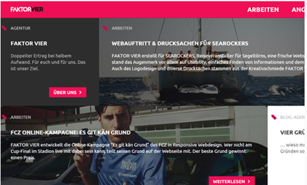
If you look on the website above, they used beautiful contrasting color effect. The layout is flat and they have focused on block-style elements. This might be one of the best examples of how to use simple color contrast in place of the vibrant color scheme.
Clear Spaced Typography
Minimalist layouts have adopted this same technique for typography by clearing lots of free space on the page. With higher contrast ratio well-spaced typography is easier and crisp to read. A clear focused typography utilizes for filling in empty and conveying direct messages. It is more effective in terms of CTAs (Call to Actions).

If you observe the above web page, they have structured the whole web page around open gusty typography. Most of the links & page headers use all caps with extra letter spacing to create a distinction from regular paragraphs and web copy.
Conclusion
The notion of flat web design comprehends so many diverse styles that it’s hard to nail down. I hope these examples can offer an expanded look at some prevalent design trends amongst designers using the flat style.
It’s still a fast-growing creed which isn’t losing mist anytime soon. While flat layouts have become an enormous component of UI design they’re still just one option of the many obstinate trends in web design.
