Very often, clean web design is taken synonymously with minimalistic design. And there is some truth in this – one of the main points of clean design is to keep the number and complexity of design elements at the minimum. However, it’s more than just that.
Minimalism is not the point of clean design, but its consequence. The point is to make the content of your website stand out, to be clear, readable and easy to navigate. This is done with a design that’s uncluttered, ordered and free from all unnecessary elements. It’s a long known fact that an average person can only keep around seven pieces of information at the time in their working memory. So choosing the most important elements and crucial info you’ll present to your audience is vital as you don’t want them to get too overwhelmed as soon as they visit your website.
Therefore, clean design is about keeping things simple and straightforward and putting the focus on the content, which does often include a minimalistic approach. It’s about elements being well spaced, colors being usually limited to a small and neutral color palette, but also about other factors that don’t have much to do with minimalism, like proper alignment that ensures clean and smooth lines, typography that can highlight the most important info and, last but not least, consistency of all the mentioned elements.
Let’s have a quick overview of some of the best examples of clean design you could use as inspiration for your website.
1. Tinker
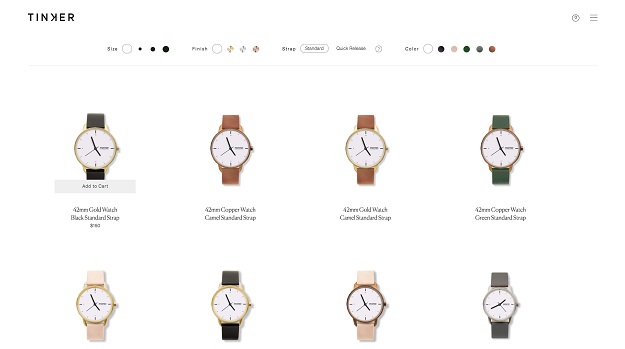
As it was mentioned before, the point of clean design is putting the emphasis on the content. And in the cases where brands are trying to sell products on their website, it’s also about prioritizing the products and ensuring smooth buying experience. This is exactly what Tinker does – no unnecessary info, easy navigation and clear, neatly aligned images of watches with loads of white space between them. The most important piece of info – the price, is obtained by simply hovering a cursor over a product.
Source
2. Leica Camera
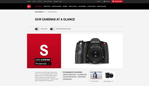
This is another example of design being used to improve the visibility of the products and put some emphasis on them. Not as minimalistic as Tinker, Leica Camera product page still offers carefully aligned large photos of their cameras, with just a sentence or two of basic info attached.
Source
3. Minne Apparel
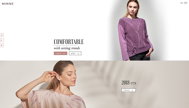
Fashion brands very often use a clean and elegant approach, which is simply a look that goes well with the nature of this industry. This design, again, puts products first – it’s got just a few large photos with a lot of blank space that has a kind of a tranquilizing effect. Clicking on photos simply lands you on the page of one of their collections.
Source
4. Snook.ca
Neutral colors work great for clean designs. Snook.ca proves that with the use of gray, you can make your content really stand out. Especially when combining it with a lot of blank space, large titles and readable formatting.
Source
5. Pixelbot
![]()
Although neutral colors do suit this sort of design very well, there’s nothing wrong with employing some of the bright ones as well. Pixelbot designers have done just that. Having just a few small vibrantly and intensely-colored details makes the website look a bit livelier while remaining clean and unobtrusive.
Source
6. Los Angeles Times
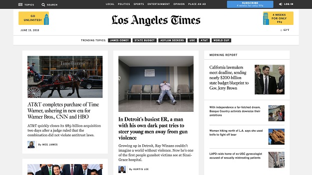
All the news portals and magazines have to face the same difficulty – organizing info in a way that won’t make the website cluttered and unreadable. Here, less is more. You don’t have to put every single headline on your home page. Instead, it’s better to make a selection of the most important articles, put the focus on them by using large fonts and blank space and make it easier for the readers to find what they might be interested in.
Source
7. DesignRush
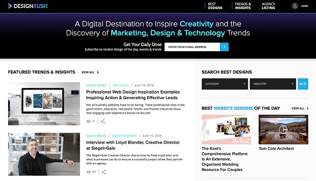
Making a small selection of articles to display them on your home page is not the only strategy you can use to reconcile a large amount of content and a clean look. Desingrush has a lot of featured articles on the left and some narrowly-focused blogs on the right, which would normally end up looking a bit messy. But here it’s avoided thanks to neat, straight lines, just enough blank space and occasional smart use of colors that are somewhere on the border of bright and neutral.
Source
8. Huge
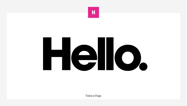
A good clean design is even better if you add an unexpected and innovative turn to it. Huge’s website is not just brilliantly simple and pleasant to look at, but also gets bonus points for turning the symbolism of its name into an ingenious design trick.
Source
9. Ava
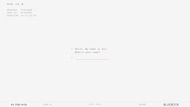
Ava is a website that used to promote the movie Ex Machina, and it’s not just well-designed – it’s whole concept is very clever. As a part of promotion, you can chat with the AI robot, Ava, that was featured in the movie as well. Some would say there’s no design at all – a gray background and just a blank space about to be filled with your conversation. A complete lack of all the other design elements is what’s so appealing about this site. It amplifies a sense of eeriness and mystery, putting the whole focus on a strange occasion such as talking to a robot.
Source
10. 52 weeks of UX
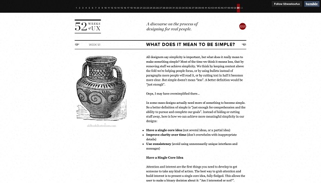
“52 weeks of UX” really keeps it simple. This is another website with both a clean design and intelligent concept. The left column is left completely blank, with the actual articles taking up just a half of the screen, which is just enough space for each of the 52UX lessons you can read on the site.
Source
11. RTA Studio
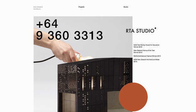
A clean approach to design can even neutralize the effect of some call-to-action or marketing tactics that would otherwise seem too salesy and in-your-face. RTA studio displays an enormously big contact phone number on their home page, yet when combined with a neat and minimal look it doesn’t seem annoying or aggressive at all. On the contrary, it fits the simplicity of the design perfectly.
Source
12. Nua Bikes
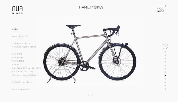
Nua Bikes is a good example of how a big number of different options can still be reconciled with a design that seems simple and minimal. Small, but readable typography and putting the focus solely on the product as the only emphasized element is what does the trick.
Source
13. Skinnyties
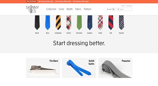
This is a website that has proved that by minimizing your design you can significantly influence your traffic, sales and conversions. In this case, are design that made the site clean and simple brought them a 42% increase in revenue and a 44% rise in visit duration.
Source
14. Design Week Portland
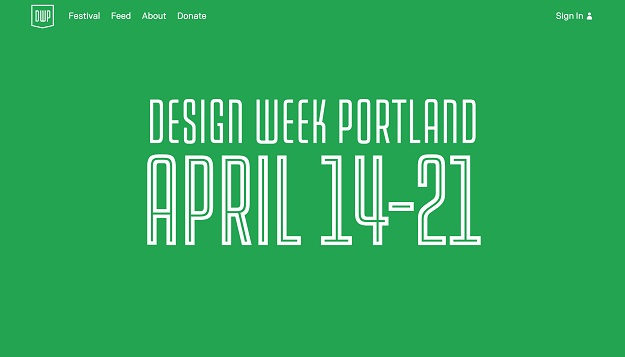
Home page of the official website of Portland’s design week is what you could call ultra-minimalistic. There’s only one piece of info written across the entire page, and that’s the date of the event. Singling out important information at its finest.
Source
15. Living Edge
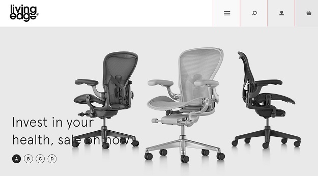
It’s important to adapt your design to your industry and the products you want to sell. Living Edge is a great example of how to amplify a feeling you want your visitors to have about your product. A neat and pleasant design makes Living Edge’s furniture seem more comfortable not just to look at, but to sit in as well.
Source
