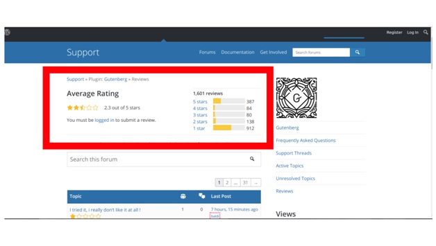
If you aren’t as attuned to the turmoil the WordPress User community is in for the past few months, then you probably haven’t heard about the WP drama happening on forums — on Reddit, and even in WordPress’ reviews itself.
Currently, people are very vocal about expressing their utter disappointment at WordPress’ new editing tool.
With reviews as absurd and ridiculous as “Dear God, make it stop,” and “Just kill it,” anyone can see that a lot of WordPress’ users are not happy.
And judging from the newest layout, I wouldn’t be one to blame them for reacting the way they do either — to be completely honest.
For the most part, I’ve had negative impressions about it, but after testing it out for myself, I can loosely see why WordPress ultimately decided on making this happen for the 5.0 update.
Like every developer looking to improve and not stay behind, WordPress’ developers only had the best intentions in mind for including the Gutenberg Editor in their latest update plans.
So, what is the Gutenberg Editor?
Gutenberg is a take on WordPress’ newest editor. It’s the new way to edit content, and replaced the old TinyMCE post content editor. And to be fair, it does a lot more too; think shortcodes, widgets, menus, and custom fields.
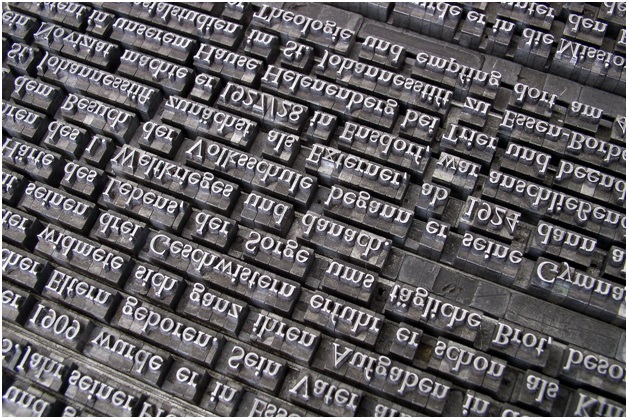
Fun fact: it was named after Johannes Gutenberg — the man who invented the movable type printing press more than 500 years ago. And the ultimate goal of developing said editor is to make editing in WordPress easier — especially for those who are starting out.
They are currently embracing the blocks in the organization system, and will probably add more layout options in the future. (You can check out the official example.)
The Pros and Cons of Gutenberg
As this post is being written, the Gutenberg Editor has over 600,000+ active installations. That means people the world over are trying the Gutenberg editor out for themselves, and making sound judgments.

With over 500 reviews, you can easily see, based on the given data that there is a big divide about the topic.
Positive Feedback
Supporters of WordPress’s newest editing tool like the following about Gutenberg:
● It represents much-needed innovation that would help WordPress keep up with other website builders.
● Great user experience for non coders — especially for those who are just interested in keeping a personal blog.
● Made with modern technology and targeted for page builders.
● There is a less need for editing HTML and adding custom codes.
● Page editing options are all in one place; not locked into custom shortcodes.
The Backlash
People’s criticisms on the new editor are ridiculous to reasonable, at best. Here are some of the more reasonable ones:
● Many are apprehensive, in that they think it will ruin existing (client) sites, especially those that rely heavily on custom fields and meta boxes.
● Criticism on the new UI and method of editing HTML with Gutenberg (some just don’t plainly like the new interface).
● It’s too focused on blogging, and not suitable for other kinds of websites.
● It’s missing features that are already on the road map.
● Blocks appear unwieldy for high-volume content creation.
By far, people working with clients express great concern over the fact that Gutenberg will ruin the layout of existing sites.
But most of all, the notion of “if it ain’t broke, don’t fix it” crop up repeatedly throughout this entire ordeal. Some even refer to the Gutenberg Editor as the end or a new beginning for WordPress.
Overall, there’s a lot of hate it or love it comments going on when it comes to what people think of Gutenberg all together.
But let’s take a look at some of the reasons why WordPress decided on developing and releasing the Gutenberg Editor in the first place. Perhaps then it would shed some light on the necessity for such a tool.
WordPress’ Five Reasons
Everything happens for a reason, and Gutenberg’s emergence isn’t any different.
Reason #1: It’s a Reaction to its Competitors
Development of the Gutenberg Editor is an obvious retaliation to WordPress’ competitors. It’s the obvious reaction to the writing experience offered by sites like Medium, and easy site-building Wix and Squarespace market.
Evidently, a project the size of WordPress requires some very intuitive ideas and a clear strategy path to help keep it going. But when that path is overwhelmed with financial pressure to stay on top of the competition, some awry decisions will suddenly be made. And sometimes, these decisions just aren’t in the best interest of everyone.
But kudos to WordPress for trying their utmost best to accommodate everybody’s — most of the time, scathing — opinions.
Their biggest concern will always be losing customers to competitors. And clearly, the creation of the Gutenberg Editor is an attempt to attract new users to the platform — most of them complete novices to HTML markups and codes.
Reason #2: It was Created for Complete Compatibility
The new block system and the modern technology (GitHub) used to build the Gutenberg editor ensured that it would be designed for compatibility across all devices.
Evidently, developers designed it with smartphone, tablet, and phablet users in mind. Gutenberg presents its users the opportunity to edit content anytime and anywhere, across any device.
That’s a definite answer to various users’ cries for integrated experiences.
Reason #3: It Was Made with Multimedia Purposes In-mind
The entire editing platform was rebuilt to accommodate posts that are rich in multimedia. Ergo, it would be ideal for visual media bloggers — especially for photographers who look to showcase their portfolio online.
In addition to allowing its users to upload a gallery into posts, the editor also gives users the freedom to edit the display size as well just by dragging the corners.
Reason #4: Blocks are a Creator’s New Best Friend
The block system was constructed to help build more engaging content. How? They are slated to let users focus on that specific content or paragraph.
And moreover, the blocks are aimed to let users rearrange, insert, and style multimedia content with very little technical tinkering and knowledge. Simply speaking, blocks will replace the crucial need for using custom codes.
WordPress basically gave its consumers the ability to create custom posts and pages — even if they’re not expert developers.
Reason #5: It’s the Beginning of a New Way to Build Site Pages
The developers of Gutenberg made it clear…
Gutenberg is more than just an editor. It’s designed to be the foundation that will revolutionize site building and customization in WordPress. It’s obviously targeted for its users who are after creating their own blog, and running it independently without an extreme need for an outsider’s help.
A Key Takeaway
The emergence of the Gutenberg project is indeed an interesting development within the WP community. The opinions of everybody are so varied and divided that it makes it all the more intriguing to await what WordPress has in store for many of its platform users.
And to be completely frank, only time will truly tell if this Gutenberg project will be a success.
After personally testing it out myself, I find it hard to deny that it definitely is a powerful software that has new users and web design & development novices in mind. Barring all negatively biased opinions, it’s a game changer — whether positive or negative, that remains to be seen.
Change can be a shocking thing, and it’s understandable when some may feel adverse to welcoming it. And despite that, many will not deny the value they see in it. It’s always necessary to grow and push forward. But that’s only when change is well thought-out, and initiated for all the right reasons — and even then, people’s motivations are always abstract at best.
What Gutenberg’s development team has managed to accomplish so far is certainly impressive.
But going by the current state of the official reviews, perhaps it’s best if the Gutenberg editor remains a plugin — not a core component.
Because with plugins, you have the option to disable them and stick with the maneuvers that you’re comfortable with. But most of all, in doing so, WordPress can accommodate the majority of the population (that expressed discontentment over the new interface) who gave the editor a one-star rating.
It’s true that you can’t please everybody. But when the negative reviews are quickly outpacing the positive ones, then perhaps it’s best to hear what they have to say.

