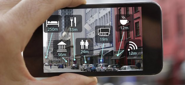
Uncharted territory once, augmented reality (AR) is becoming increasingly popular. Armed with Apple’s ARKit and Google’s ARCore, developers are coming up with creative ways to put the tech at our fingertips — from chasing pokemons to jazzing up selfies with puppy ears.
Tapping into our natural curiosity, augmented reality gets us easily excited by the promise of an illusory digital world, and the demand for AR apps is booming. Since the release of iOS 11, AR apps built with ARKit exceeded 13 mln downloads. But this excitement can easily turn into disappointment if poor design prevents users from figuring out how to use your AR app in the first place.
A mobile augmented reality experience is less intuitive to users than any 2D mobile apps. So UX designers need to make sure their design choices will not have users scratching their heads. You can never go wrong if you follow best UX design practices, but these useful tips will help you delight users with stellar AR experiences.
SIMPLIFY THE ONBOARDING PROCESS
Mobile apps have become an indispensable part of our daily routine. Statistics suggest that we use about 10 apps a day. So we know the basic principles and understand the logic behind most in-app interactions, which allows us to often skip a tutorial provided upon the first launch of a new app.
But things are different with AR apps. With no prior experience to lean on, users would appreciate a proper tutorial that informs them what this app is about and how to use it. A demo video, visual hints or animated walkthrough — however you choose to onboard your users, make sure it is simple and describes the app’s core case.
Here’s a great example of onboarding done right.
Remember though not to make your onboarding too lengthy. Excited to test the AR waters, users will easily lose patience if they need to walk through numerous introductory slides describing every tiny feature.
UNCLUTTER CAMERA VIEW
In AR-enabled apps, a device’s camera becomes the window through which a user experiences augmented reality. And if the camera view is cluttered with excessive information or numerous screen-locked UI elements, you run the risk of compromising experience for users, leaving them overwhelmed and confused.
This is when less is more, and a clean, unobscured camera display will help users better immerse into the AR illusion — which is the ultimate goal of an AR experience.
KEEP IN MIND THE CONTEXT OF USE
The real world view in a phone’s camera is the background for your augmented reality app, and this brings another challenge for UX designers. Users can open your app anywhere — home, outdoors, in a shopping mall — and each time the view will be different.
While you may not control the context your app is used in, you still need to design with this variety in mind. Test your design to make sure it performs well against a diversity of backgrounds and lighting conditions.
MINIMIZE COGNITIVE LOAD
Cognitive load is the mental effort needed to carry out a task. Your design choices can either decrease this load or increase it to the point of making a user give up on your AR app altogether.
To lighten the cognitive load associated with using a new tech, UX designers need to innovate in small doses and add familiarity to the whole experience. Even in an AR app, there is no reason for buttons not to look like ones. Taps, drags, and swipes are well-known gestures that will help users to effortlessly interact with your AR app.
ADD CUES FOR GUIDANCE
Cues can be enormously helpful in designing a seamless user experience. They guide users through the journey and help them better interact with the app.
Accustomed to traditional flat screens, users might find the first-run AR experience challenging — but not if you provide simple yet informative visual and audio cues. Adding hover effects to buttons and highlighting interactable elements will nudge the user to look around and explore the off-screen space. Sound cues serve the same purpose as they help users examine the 360-degree environment and notice carefully designed AR elements.
That being said, make sure your audio and visual cues are complementary and do not distract the user from all the magic happening in front of them.
SUMMING UP
Augmented reality is pushing the boundaries of design, making UX professionals think outside the box and find the ways to leverage the tech without compromising the user experience. And this is no easy feat as the guidelines and best practices for AR are just starting to shape up. But what always helps is putting your users first —- and your users will definitely appreciate easy onboarding, clean camera display, and subtle but informative cues.

