It’s no secret that we all spend increasingly more time on our smartphones. According to research, US adults spent over 3 hours per day on mobile devices in 2018. It’s expected that mobile will surpass TV as the most popular medium in the US during 2019. Among other things, this means that small screen sizes will continue to play a crucial role in web design. If you want to stay on the top of the web design game and show your customers that you care about their experience on your website, you simply must pay special attention to responsiveness.

Websites that function smoothly across all devices, including desktops, laptops, tablets, and phones, are no longer optional. They’ve become mandatory. On the other hand, keeping visitors on web page for an extended time period has never been more challenging. There are already some great free fully responsive WordPress themes you can get your hands on right now, but if you want a website with a unique character, some web design tricks and tips could be game-changing.
Here are our favorite responsive web design and UX trends in 2019 that are sure to help you grab your user’s attention and stand out from the crowd.
1. Vector Graphics
The great thing about vector graphics is their scalability. In other words, they can be resized without losing visual quality. In other words, by using vectors you will ensure your graphics appear crystal clear on both large screens and small devices.
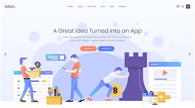
Foton – A Multi-concept Software and App Landing Theme
2. Hidden Menus
Hidden menus are another trend to keep your eyes on this year. Once used only for mobile devices, menus that open when the user clicks an icon (usually the ever popular “hamburger” icon) are slowly making their way to desktop design. This type of menu keep your pages clean and uncluttered and is usually paired with a minimal website layout.
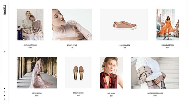
Byanca – Modern WooCommerce Theme for Clothing Brands and Shops
3. One Page Websites
We’ve all gotten used to endlessly scrolling through our social media feeds. Maybe that’s the reason one page websites have become so popular in the past few years. These sites display all their content on a single long page. What makes this great when it comes to responsiveness is that you only have one page to worry about. So, if you think everything you have to say can fit in a single page, this type of website might just be the best choice for you.
4. Card-Based Design
Another hot web design trend for this year is displaying your content in “cards”. Each card usually contains an image and some text. The use of rectangular card shapes allows for the content to be easily arranged into a grid layout. This type of layout not only looks great, but is also extremely intuitive and can easily be adapted to fit any screens size.
5. Innovative Scrolling
Traditional, vertical scrolling is the most common way to navigate a website. Nowadays however, web design companies have started experimenting with different scrolling techniques in order to create unique, memorable online experiences. For example, if you want to create a portfolio website that will mainly consist of images, horizontal scrolling is a great way to showcase your work in a fresh manner.
6. Gradients
Not so long ago, everyone was talking about Instagram’s logo rebranding. Since then, its iconic gradient style has influenced many other designers and brands. Gradients make the transitions between colors seem more natural, and that’s exactly why more and more designers are applying gradients to their UX design.
7. Interactive Web Design
High-quality content is a must if you want your visitors to stay longer on your website and make sure they keep on coming back. But, if you want to take your site to another level, think about incorporating user interactivity into your overall design strategy. Engaging features that allow interaction with users can increase the time visitors spend on your page and present your brand in an original way.
8. Minimalism
When it comes to good web design, less is often more. In order to focus on efficient UX, designers have started paring down the number of elements they add to a website. The combination of simplicity and beauty is the way to go if you want to set yourself apart from your competitors and ensure a smooth experience for your users.
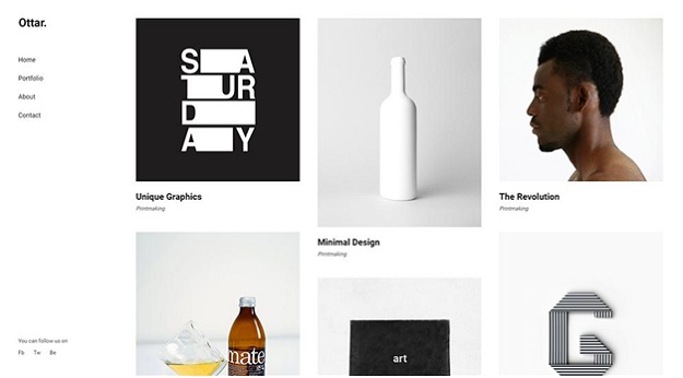
Ottar – Contemporary Portfolio Theme
9. Scroll-Triggered Animation
Scroll animations are another trend that definitely deserves your attention. These animations are triggered as a user scrolls through your page content, and can even have an interactive element to them. This advanced type of animation can leave a lasting impression on your website visitors and ensure they keep on coming back. Not to mention that it looks great as well.
10. Detailed Footers
Detailed footers are a trend that looks like it might become a standard in the future. Besides basic contact info, more and more websites are adding additional links and even full website navigation to their footers. This provides users with more content to explore, even when they reach the bottom of your page.
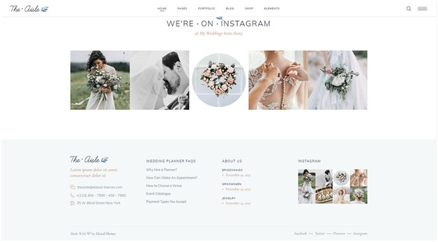
The Aisle – Elegant Wedding Theme
Conclusion
Besides great (and fully responsive) web design, an enjoyable user experience is one of the most important factors for your website’s success. Feel free to experiment with these innovative design trends and UX functionalities to find a style that perfectly fits your needs. And if you think there’s something we missed in our list, share your thoughts with us!
