The number of internet users which were 2 billion in 2010 has crossed the mark of 4.6 billion in 2021! If you’ve been proactive enough to build an impressive business website, kudos to you. It’s even more commendable if you are investing in social media marketing, SEO, and online marketing. However, nothing would count if the ROI of your website is poor. Your website’s success rate is determined by its conversion rate. In this article we will discuss about how to upgrade your website and make change in your websites to boost sales.
It takes only 0.05 seconds for the users to form an opinion about your business website and decide whether to stay or leave. To attract, engage, generate leads, and sell your products to the amplifying internet user base with ‘goldfish’ attentiveness, you must have a website that stands out from the crowd.
By that, we don’t mean you should upgrade to merely an aesthetically appealing setup. A successful website focuses on catering to the core need of visitors that eventually leads to higher sales. This article will explain seven things you can change in your website to boost sales. Let’s get started.
#1: Attention-Grabbing Home Page
There are more than 1.8 million websites out there.
Considering the massive competition, you must go the extra mile and redesign your website in the best possible manner.
While redesigning, you should ensure that the elements on your homepage or landing pages, such as images, content, videos, sections, and infographics don’t overcrowd the space. Your website should speak of the values you provide to the customers and how they can benefit from your services. Even while choosing the colours and font type of the text, try to keep it simple. Everything you do must be customer-centric.
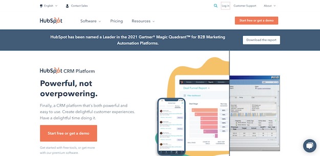
Have a look at how HubSpot’s homepage has maintained a perfect balance between simplicity and appeal.
The design speaks of value-addition to the customer more than the products.
Remember when it comes to the website, the first impression is the last impression! You only have 50 milliseconds to convince the users to stay.
Therefore, if you focus on creating a great user experience on the home page, half of your job is done!
#2: Authority and Trustworthiness
It may sound cliché but content is the king of digital space.
The most popular search engine, Google, loves high-quality content that solves user queries.
Google’s game is simple. The more user-centric, relevant, informative, and useful your content, the higher ranking you get!
To encourage webmasters to deliver high-quality content, Google has proposed Quality Rater Guidelines (QRG), which evaluates your website’s ‘E-A-T’ score.
Here’s what E-A-T stands for.
# Expertise – It refers to the knowledge, skills, and deep insights about a particular topic or domain. Google expects well-researched content written by subject matter experts.
# Authoritativeness – It’s about the reputation of the website. When the audience refers to a particular website as a go-to source about related topics, then that’s called authority.
# Trustworthiness – Trust of readers depends on the accuracy of the information on the website. To build trust, websites should focus on providing detailed and accurate content.
More than the how, what you present matters. For instance, instead of focusing on content font type, you first pay attention to adding relevant content that answers the common service-related queries of the users. Here, relevant content matters more than its font type. Of course, keeping it simple is essential. But prioritizing key aspects will get you the best ROI.
You may further include impactful testimonials, case studies, customer success stories, and offer live chat with your domain experts to instil the trust factor in the minds of visitors.
#3: Responsive Design
Around 59% of the total organic search engine visits in 2021 were performed using mobile devices.
The number says it all!
If you lack a responsive mobile-friendly design, you are bound to lose a humongous number of potential customers.
To update your business website and make it mobile-friendly, you will need to concentrate on the following aspects.
1. Apply a mobile-responsive template that complements your brand theme.
2. Use light images and CSS to avoid loading speed issues.
3. Strip back the content and highlight what matters to the user.
4. Try to avoid flash as it is not required in general cases.
5. Place the links at a distance so that users don’t click on the wrong links.
6. Change the icon or button size as per the screen space and layout.
7. Use a simple and readable font to offer easy navigation to the users.
8. Try to remove unnecessary pop-ups on the page for better search.
9. Test regularly for smooth user experience.
Having said that, every business website is different and needs customization.
Get in touch with a website designing expert to understand the customizations that your website would need in real-time.
#4: Fast Loading Speed
While the businesses keep a close tab on factors such as content, SEO, images, videos, they overlook the website loading speed factor.
But loading speed is the most crucial factor that directly impacts your conversion rate.
79% of online buyers admit that they won’t go back to a website if the loading speed troubles their shopping experience.
Let me quote a simple example to help you see the situation from the buyer perspective.
‘You are feeling tired and hungry. You go to a restaurant and ask for your favourite dish. The waiting time is 15 minutes. Meanwhile, you see other people enjoying their meals. It’s been an hour and the order hasn’t arrived.’
In this case, what would be your reaction?
You might cancel the order and leave the place to eat somewhere else. Chances are, you wouldn’t revisit the place in the future due to the bad experience. What’s worse? You would write a negative review for this business on Google.
The same thing applies to the digital landscape!
When a potential customer arrives on your website and your website takes too much time to load, the customer may exit the website, buy from another brand, and never come back again.
Here are a few top tips to improve loading speed.
# Implement an optimized and tested hosting solution for better performance.
# Compress and optimize all the images on the website.
# Try to avoid unnecessary redirects on the pages.
# Leverage a quality content delivery network (CDN).
# Reduce or eliminate unnecessary plugins on the website.
#5: Sense of Urgency in the Marketing Copy
A sense of urgency boosts the entire sales process by impacting the psychological aspect of the users.
For instance, people who add products to the cart may wait until a period before buying them. They may not have adequate funds or need more information to make a purchasing decision. In other words, they need that nudge to decide.
Creating a sense of urgency curtails the waiting period and encourages the user to buy the product at the earliest.
To invoke a sense of urgency seamlessly, you may apply the given simple techniques.
# Add a promotional sale offer with an end date.
# Provide coupons on packages with limited time.
# Offer a compelling deal valid till a short frame of time, for instance, 30 minutes.
# Offer same-day or next-day delivery options to nudge customers to buy quickly.
#6: An Optimized Check-Out Process
Imagine people visiting your website, adding products to the cart, and then suddenly leaving without completing the checkout process.
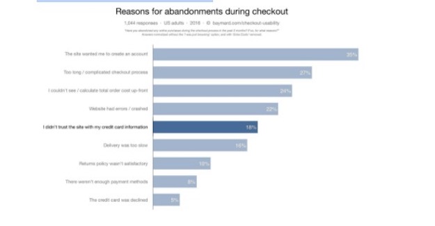
That sounds terrible but this is what happens when your check-out process is complicated. Consider this Baymard
Institute research that stated how 27% of cart abandonments happened due to a complex checkout process.
Complicated checkout involves adding too many steps, such as asking for unnecessary personal details or painfully long forms. Acknowledge that your customer’s time is precious. There’s a reason why they have chosen your store over a physical store or any other online shop. Adding extra steps in the checkout process will only take them closer to considering cart abandonment!
Here’s what you can do to optimize the checkout process.
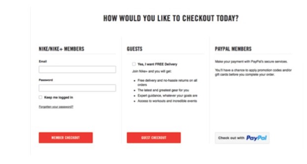
# Offer guest checkout options to avoid sign-ups.
Take a glance at Nike’s guest checkout provision for its users.

# Merge login options with social media channels.
# Offer free shipping for a minimum quantity.
# Provide multiple payment options for users’ convenience.
To make the payment process convenient for the users, you’ll see how MindMeister has added multiple payment options.
#7: Personalized Call-to-Action
Finally, update and personalize the existing call-to-action buttons (CTAs).
We are emphasising personalization because that’s what’s going to help you convert!
CTAs that seem pushy can upset the customer easily. Don’t force the customers to buy your product. Try to resolve their challenges rather than displaying the promotional stuff.
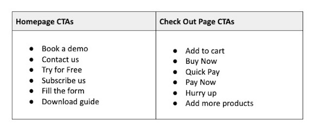
Consider these CTA buttons for various pages along with relevant content –
Personalization with respect to the page content multiplies the user engagement.
Thus, CTAs can prompt potential customers to take appropriate action and give you a picture of engagement rate and conversion rate.
Conclusion
Your website is the identity of your business. It is the first thing your prospective customers come across that helps them form an impression of your brand. Hence, your business website should be designed to convert.
Infuse new life into your business by revamping your existing website with the tips we mentioned in this blog. These seven tips will positively impact your sales. Implement these tips to grow your customer base and attract returning customers to your website.


