
Data visualization is an integral part of data analysis, enabling us to understand complex information and uncover valuable insights. Python, a popular programming language, offers a wide range of libraries that excel in visualizing data in various formats. In this article, we will explore the 10 best data visualization libraries for Python, highlighting their features, capabilities, and popularity among data scientists and analysts.
1. Matplotlib
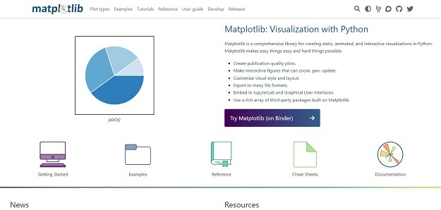
Matplotlib is one of the best and widely used data visualization libraries for Python. It provides a myriad of nifty and comprehensive set of tools for creating static, animated, and interactive visualizations. With its intuitive API and extensive customization options, Matplotlib helps users to create plots, charts, histograms, and more. While it is known for its slightly verbose syntax, Matplotlib’s versatility and extensive documentation make it an excellent choice for beginners and advanced users alike.
2. Seaborn
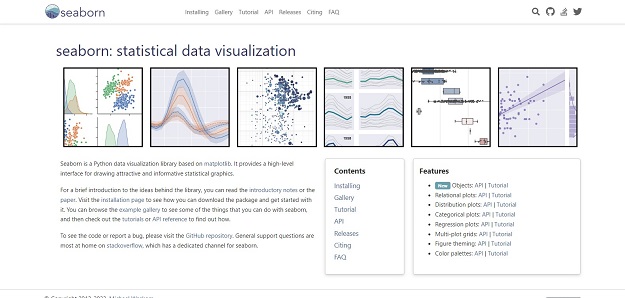
Seaborn is a Python data visualization library based on matplotlib. It provides a high-level interface for drawing attractive and informative statistical graphics. Seaborn’s strength lies in its ability to create aesthetically pleasing visualizations effortlessly. It provides predefined styles and color palettes, simplifies complex tasks like multi-plot grids and statistical estimation, and enhances the default Matplotlib plots. Seaborn is particularly useful for visualizing statistical relationships and patterns in datasets.
3. Plotly
Plotly is a powerful library that allows for interactive and web-based data visualization. With its elegant and interactive visualizations, Plotly is well-suited for creating dashboards and sharing visualizations online. It supports a wide range of chart types, including line plots, scatter plots, bar charts, and 3D plots. Plotly provides APIs for Python, R, and JavaScript, making it easy to create dynamic visualizations and embed them in web applications. Additionally, Plotly’s online platform, Plotly Chart Studio, enables users to share, collaborate, and publish their visualizations.
4. Bokeh
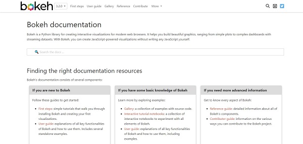
Bokeh is a Python library for creating interactive visualizations for modern web browsers. It helps you build beautiful graphics, ranging from simple plots to complex dashboards with streaming datasets. With Bokeh, you can create JavaScript-powered visualizations without writing any JavaScript yourself. Bokeh provides a high-level interface for creating plots, charts, and dashboards, and it supports streaming and large-scale datasets. With its server-based architecture, Bokeh allows for easy integration of interactivity and data updates, making it suitable for building interactive data exploration tools and real-time monitoring systems.
5. Vega-Altair
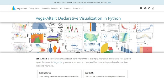
Vega-Altair is a declarative visualization library for Python. Its simple, friendly and consistent API, built on top of the powerful Vega-Lite grammar, empowers you to spend less time writing code and more time exploring your data. It leverages the Vega-Lite specification, which defines a concise JSON syntax for representing visualizations. Altair’s unique strength lies in its intuitive grammar of graphics, which allows users to express visualizations concisely and abstract away low-level details. By enabling easy interaction and exploration, Altair empowers users to create complex visualizations with minimal code. Altair also seamlessly integrates with other Python libraries, such as Pandas, making it an excellent choice for data analysis and storytelling.
6. Geoplotlib
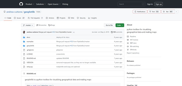
geoplotlib is a python toolbox for visualizing geographical data and making maps . geoplotlib automatically handles the data loading, the map projection, downloading the map tiles and the graphics rendering with OpenGL.
7. Plotnine
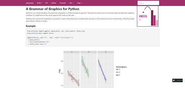
Plotnine is another Python library inspired by ggplot2. plotnine is an implementation of a grammar of graphics in Python based on ggplot2. The grammar allows you to compose plots by explicitly mapping variables in a dataframe to the visual objects that make up the plot. Plotnine seamlessly integrates with Pandas dataframes, making it convenient for data manipulation and analysis. It offers a variety of geometric shapes, statistical transformations, and scales to customize visualizations. With its emphasis on clarity and conciseness, Plotnine allows users to create publication-ready visualizations with ease.
8. Holoviews
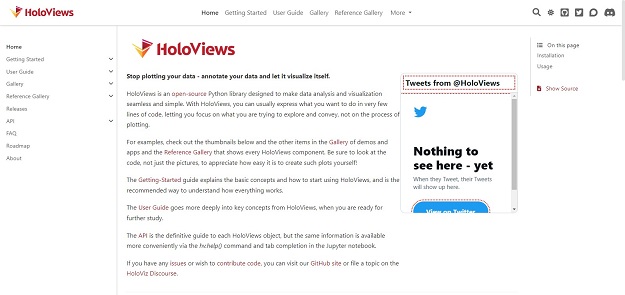
Holoviews is a Python library that simplifies the creation of interactive visualizations by focusing on the data itself. It provides a consistent high-level API for various plotting backends, such as Matplotlib, Bokeh, and Plotly. Holoviews allows users to work with rich data structures and declaratively specify visualizations using Python objects. By providing a concise and expressive syntax, Holoviews enables rapid exploration and iteration of visualizations. It supports a wide range of chart types and offers interactive tools for zooming, panning, and exploring the data.
9. Geopandas
Geopandas is a Python library specifically designed for working with geospatial data. It extends the capabilities of Pandas to handle spatial data, making it easy to visualize and analyze geographic information.
The goal of GeoPandas is to make working with geospatial data in python easier. It combines the capabilities of pandas and shapely, providing geospatial operations in pandas and a high-level interface to multiple geometries to shapely. GeoPandas enables you to easily do operations in python that would otherwise require a spatial database such as PostGIS.
Geopandas provides a high-level interface for reading, manipulating, and visualizing geospatial data, such as shapefiles and GeoJSON files. It integrates with Matplotlib and other plotting libraries to create maps, choropleths, and spatial plots. Geopandas is a valuable tool for geospatial analysis and is widely used in fields such as urban planning, environmental science, and transportation.
10. NetworkX
NetworkX is a Python package for the creation, manipulation, and study of the structure, dynamics, and functions of complex networks. It provides tools for creating, manipulating, and analyzing network graphs, making it suitable for visualizing social networks, biological networks, and transportation networks, among others. NetworkX integrates with Matplotlib and other plotting libraries to create visual representations of networks, including node-link diagrams, matrix plots, and geographic layouts. It offers various algorithms for network analysis and visualization, enabling users to explore network properties and uncover meaningful insights.
Conclusion
Python offers a diverse and powerful ecosystem of data visualization libraries that cater to different needs and preferences. Matplotlib, Seaborn, Plotly, Bokeh, and Altair are widely regarded as the top choices for creating visualizations in Python. These libraries provide comprehensive tools for creating static, interactive, and web-based visualizations. Additionally, ggplot, Plotnine, Holoviews, Geopandas, and NetworkX offer specialized capabilities for specific data types, such as statistical data, geospatial data, and network data.
Whether you need to create basic plots, explore statistical relationships, build interactive dashboards, or visualize complex networks, these libraries provide the necessary tools and functionality to make your data come to life. By leveraging the power of these data visualization libraries, Python users can effectively communicate insights, analyze complex data, and make informed decisions in various domains and industries.